Let’s be honest: email is a dinosaur. It’s been around for decades, far longer than social media, and was even in use before the invention of the World Wide Web or the popularization of the PC.
But despite its long history, email remains a staple channel for both business and personal communication. You likely check your email multiple times per day, if not per hour, and you rely on it to stay in touch with customers and prospects.
So how does a technology with such ancient roots manage to endure and stay relevant in 2017? Smart email pros are constantly coming up with innovative ways to make email better.
We’ve identified a few cool tricks and interesting trends to watch out for (and, if you’re feeling ambitious, try your hand at) this year.
1. CSS Animations
Gone are the days when email was static. In 2017, you’ll see more and more brands incorporating motion into their email campaigns, and the most cutting-edge way to do that is with CSS animations.
Unlike animated GIFs, which often have a large file size that can be unwelcome on mobile, CSS animations are lightweight and smooth. And with increasing email client support, they’re finally a viable option for email marketers.
The best way to use CSS animations in email is to add subtle, non-essential enhancements like fading in a logo or animating a small part of a graphic. As long as your email doesn’t rely too much on the animated elements to get the message across, you’ll be in good shape no matter which client the recipient uses.
Email on Acid has a great introduction to CSS animation in email, including several creative real-life examples.
2. Video (With Graceful Fallback)
Another not exactly new but increasingly popular email trick is including video content in your campaign. Your options used to be limited to animated GIFs or static images with fake play buttons on top, but HTML5 now allows you to actually embed video in the body of your message.
Tread with caution, however, because support for HTML5 video is spotty and subject to frequent change — according to Campaign Monitor, about 62% of the market uses clients that support HTML5 video. That’s what makes having a fallback image so important. Thankfully, HTML5 allows you to include a fallback easily.
And studies have shown that including video is well worth the effort; marketers have seen huge increases in engagement when using video in email.
For the HTML-inclined, Email on Acid (once again) offers a comprehensive guide to implementing embedded video in email.
3. Innovations in Interactivity and Navigation
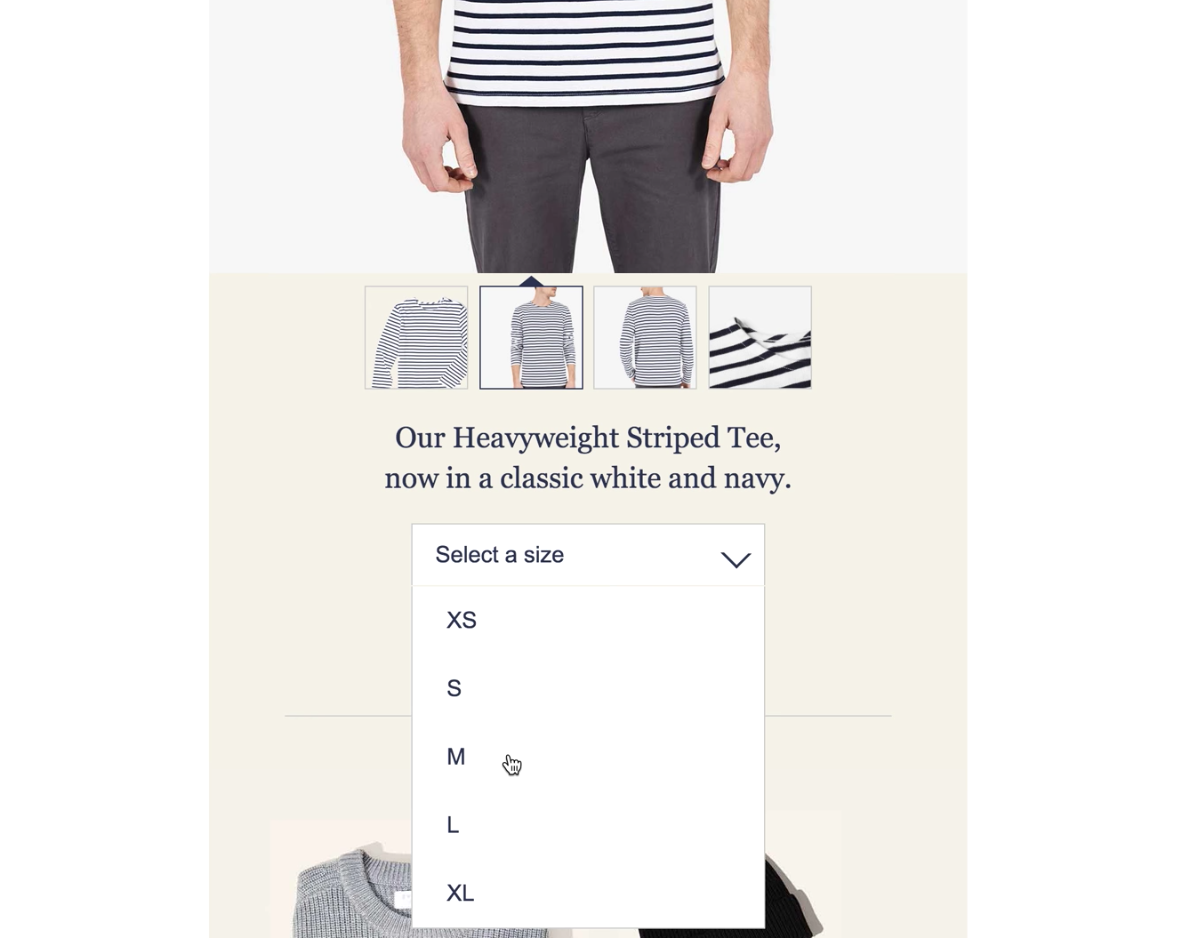
2017 will be the year that more emails than ever start to look — and function — like websites.
From hamburger navigation menus on mobile…
Check out more examples and some strategic analysis over at Litmus.
4. Mobile-First Design
Depending on your audience, up to 70% of your emails could be read on a mobile device. That should drastically change the way you think about email design — at the very least, mobile optimization should no longer be an afterthought or a “nice to have.”
Rather than starting with a desktop design and then reverse-engineering it to work well enough on mobile devices, modern HTML emails should start with small screens in mind and expand from there. That means paring down the complexity of your layout, ensuring that text and buttons are big enough to read and tap, and testing across multiple screen sizes and devices.
You don’t have to be an HTML expert to make sure your emails read well on mobile. This guide from Flywheel walks you through the basics of mobile-first design.
5. Images Optimized for Retina Screens
Thanks to Apple, screens with pixels so tiny they can’t be seen by the naked eye are now the norm on mobile devices. That means your regular web-resolution images are going to look blurry on an increasing number of screens.
Fortunately, there’s an easy way to make your email’s images pop on Retina screens: simply double the pixel size at which you create/save your image, then use the width and height HTML attributes in your email code to force the image down to its intended size.
This should become a standard part of your email production process in 2017 (if it isn’t already). Extremely high-resolution screens are only going to get more popular, not less.
If you need more details, Litmus’ guide to Retina screen image optimization is the best I’ve seen.
Wrap-up
Staying up to date with email marketing trends can seem like a big, ominous project, but it doesn’t have to be that way. If you need help putting the puzzle together, we’re always happy to help!


![Better Email Etiquette Equals Better Marketing Results [16 Rules]](https://www.outboundengine.com/wp-content/uploads/shutterstock_411184843-1-400x250.jpg)

