Email newsletters are a great way to strengthen connections within your existing customer base. Reaching out on a regular basis will not only increase your chances of staying top of mind, but also allow you to establish credibility as an industry thought leader. Not to mention, a whopping 91 percent of U.S. adults say they enjoy receiving promotional emails from trusted brands.
But not all email newsletters are created equal. Happy customers will gladly tune you out if you fail to offer valuable content or an aesthetically-pleasing template. Take a look at our top seven tips for every email campaign:
1. Optimize for mobile, because ‘mobile-friendly’ is no longer enough.
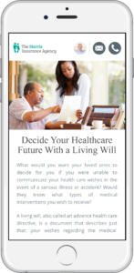
 According to Litmus, mobile devices accounted for 54 percent of all email opens in 2017. They also noted that 51 percent of consumers have unsubscribed from a brand’s emails because certain key elements (like the email itself or the website) didn’t display or work well on their smartphone.
In other words, mobile optimization is no longer a neat option; it’s a necessity. In the meantime, consider switching to a mobile-responsive email template, which will automatically adapt to any device or screen size. It will not only make things easier on you, but also ensure a better user experience for your audience.
2. Design for functionality.
Like mobile optimization, email functionality is absolutely essential to an email campaign. There are several factors that influence how a recipient will view the email, “including the type of device (e.g., mobile vs. desktop), the brand of the device (e.g., Mac vs. Lenovo) and whether the recipient reads email in a browser (e.g., Chrome or Safari) or uses a desktop email client (e.g. Microsoft Outlook or Apple Mail). All of these applications support different subsets of HTML and CSS, which leads to different ways of displaying the same email.
Additionally, certain things that work for web design — like HTML semantics, external style sheets and JavaScript — don’t translate well for email. We recommend using inline CSS for each unique paragraph, image and design element, which should help you avoid issues with external style sheets. It’s also worth considering HTML tables, which are nearly universally supported and thus extremely reliable.
3. Design with intention (and brand consistency).
Choose colors and images wisely. You want customers to seamlessly associate the email with your brand, which means professionalism is key.
Remember that most recipients will view the email from a mobile device, meaning many will be on the go. To break through these distractions, use concise text, informative subheadings, and bold text or bullet points to emphasize pertinent information. Give readers just enough to grab their attention and foster engagement. As a baseline, Constant Contact found that highest click-through rates came from emails with roughly 20 lines of text.
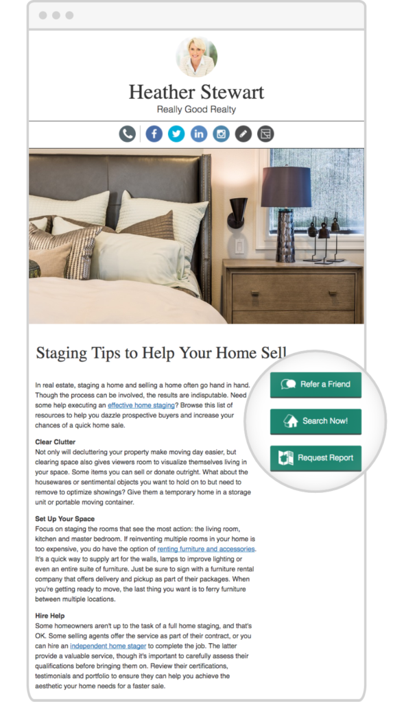
Even if you’re using a mobile-responsive template, remember that things can look very different on a smaller screen. Use a minimalistic approach to avoid unnecessary clutter in your text, images and calls to action (CTAs). Additionally, make sure your CTAs are visible and self-explanatory, including buttons for email forwarding and social sharing.

4. Keep your fonts and images simple.
A quirky or unconventional font may seem like an artistic way to stand out, but it’s possible that your recipients will never see it. Unless you use web fonts — which may be tough for a beginner — your carefully chosen font will only display if the recipient has that font installed. Choose a web-safe font to ensure they see the same thing you do, and make sure your body copy size is at least 14px for readability.
Although visual content is usually well-received, sometimes less is more — as emails with three images or fewer produce the highest click-through rates. This can be tricky to pull off in an email, since certain images may not load properly. Remember to include alternative (alt) text to appear in lieu of the image in case this happens, particularly if your CTAs are image-based (keep in mind that image-based CTAs are not a best practice).
5. Always have a backup option for HTML.
Don’t forget to include a plain text version of your email newsletter. While most email clients can handle HTML in 2017, it’s always better to be safe. Plus, some users may prefer the format. You should also include a web browser version link to give recipients the option of viewing emails outside of their email client.
6. Cover every CAN-SPAM requirement.
There is no way around it: Without following every CAN-SPAM regulation, you will not only face deliverability issues, but also jeopardize your status as an email marketer. Yikes.
Luckily, CAN-SPAM compliance is pretty straightforward. Here’s high-level overview of email marketing regulations:
- Do not include false or misleading information anywhere in your email, especially any identifying information like From, To and Reply-To.
- Do not use deceptive subject lines.
- Clearly identify if an email is an ad.
- Always provide a physical mailing address in your email.
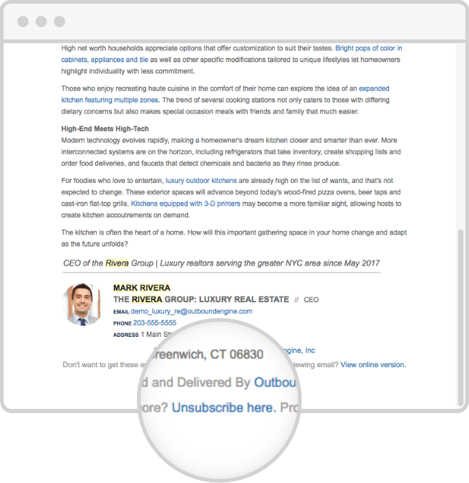
- Make it easy for recipients to opt out, using a self-explanatory, visible opt-out link.
- Honor opt-out requests ASAP. (Any opt-out link must be active for at least 30 days after the send date, and you must honor the opt-out request within 10 business days.)
- Hold yourself accountable for compliance, even if a separate company is handling your email marketing (you are both legally responsible for compliance).

7. Test your designs before sending.
Always do a trial run before sending an email campaign. In fact, do as many trials as possible using a variety of email clients, browsers and operating systems across desktop and mobile devices. Any differences in display can help you improve your design.
Wrap-up
Like any new skill, designing a powerful email newsletter will take time, effort, trial and error, particularly if you are new to HTML and CSS. If you’re short on time (or patience), don’t hesitate to ask for help. We’re only a click away.
Updated 7/18/17; Originally published 4/4/16


![Better Email Etiquette Equals Better Marketing Results [16 Rules]](https://www.outboundengine.com/wp-content/uploads/shutterstock_411184843-1-400x250.jpg)

